


Newsletters are text-heavy, but they’re still visual media. The best newsletters communicate visually, and our readers always respond positively when we include beautiful charts and graphs.
One of our favorite chart-and-graph merchants is Amanda Shendruk, a visual journalist with around 15 years of experience in the field.
For this edition, we called her up to get lesson on the principles of good data visualization.
In this episode:
— Natalia Pérez-Gonzalez, Assistant Editor
Stop fixing your notetaker's mistakes before you send the recap

We've all just accepted that meeting notetakers mess up names, terms, and who-said-what. You know, the stuff you actually want to know.
Wispr Flow Notetaker gets it right from the start. It knows who's on the call from your calendar invite, so the transcript says Priyanka, not Speaker 2 — and if a name's off, just fix it once and it updates everywhere.
Notetaker runs locally on your device, so it catches every conversation, calendared or not: Zoom, Meet, a Slack huddle, whatever. Then it hands that clean record straight to Claude or ChatGPT over MCP, so you can ask anything about any meeting without copy-pasting a thing.
#WisprFlowPartner
This is an advertisement.


A story in visuals
Fifteen years in data journalism has trained Amanda Shendruk to see the stories in numbers — and to always question how they’re presented. It’s an instinct that can turn an afternoon of idle scrolling into an award-winning investigation.
In 2022, Amanda was casually scrolling through H&M UK’s website and noticed each garment was listed with a sustainability scorecard, signaling to shoppers which items had cost the planet less. Naturally, she began digging into the numbers, curious about where they came from.
She toggled on the site’s code view, and, sifting through the data underneath, noticed the it didn’t match the publicly-displayed numbers on the item she happened to be looking at.
Perhaps a glitch? She scraped the site to find out.

More than half the scorecards she analyzed overstated a garment's environmental benefit, and in the worst cases, the published number was the reverse of the source data. A dress advertised as made with 20% less water than a conventionally made equivalent had actually been made with 20% more. H&M had hard-coded words like "less" and "reduction" into the system, so whatever the real figure said, a customer saw good news.

H&M’s code contained placeholder text that pulled in sustainability data for each product, but the language surrounding those numbers was manipulated for positive results. Here’s what some of the code looked like.
Amanda’s resulting Quartz investigation won a business data award, and within days, H&M pulled the scorecards. Three weeks later, a class-action complaint filed in New York cited Amanda's reporting in its first footnote.
“For me, that’s better than an award,” she tells us. “Making some kind of impact.”

Communication is a responsibility
A chart or data set is one of the most portable things a creator can publish, liable to land in a newsletter, on Twitter, in a short-form video — everywhere. Any editorial product is enriched by how well its text partners with its visuals, and the most effective visual storytellers know how to guide the reader through a set of numbers.
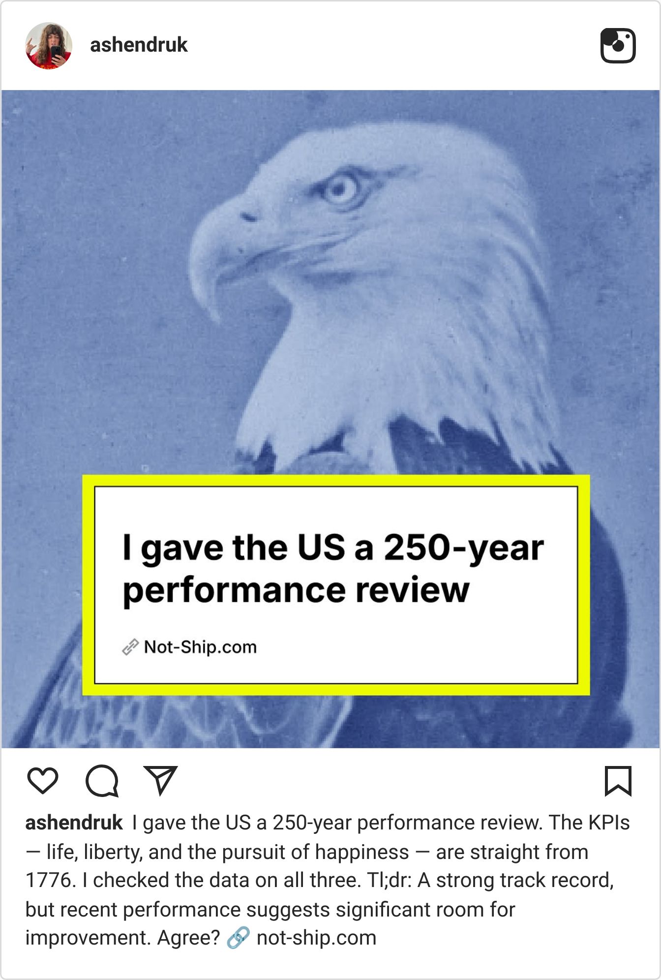
Amanda learned that lesson through design first. Her father, a corporate logo designer, taught her that a logo should work in black and white before it works in color. In college, she designed pages for her student newspaper and became fascinated by how layout could direct a reader’s attention. She wanted to delve into explanatory journalism, a way to make the messy parts of life easier to understand and digest.
Where did this number come from? Is it right? What happens if I check the rest? Amanda’s sense of curiosity consistently guides her sourcing, her approach to visualization.
Her combination of skills — reporting, data, and design — have since taken her through roles at Quartz and The Washington Post, with freelance stints for organizations including the Canadian government and World Economic Forum.
In a newsroom, Amanda tells us, everyone already understands the audience and the assignment. Clients forced her to explain why a visualization was useful, why she'd made each choice and, crucially, to see the work from the perspective of someone encountering it for the first time.
That now shapes her standard for a chart; Amanda isn't making data art. “They’re tools,” she tells us. If the reader has to work to figure out what the tool is telling them, something has gone wrong.
Her newsletter, Not-Ship, runs on this ethos. Amanda starts with something she doesn’t understand — a political question, a strange claim, even jealousy over how much vacation Europeans get — and asks what the data can tell her.

Graphic from a Not-Ship story on nations’ food self-sufficiency.
She launched the newsletter in October 2025, while leaving The Washington Post, at a moment when both her career and the world felt unusually difficult to make sense of.
"I don't know how to solve any of these huge problems that we're dealing with in the world, but what I do know is data."
This newsletter is her answer to that, and it's free, with no paywall on the archive, funded by readers who want it to exist. Paid subscribers receive all the data behind everything she does, kept in spreadsheets they can access.
Amanda’s approach to data, as expressed in her newsletter, is her way of making sense of the uncertainties of life, of making more a messy world a more legible.

A few notes on creating charts people actually read
Creating an effective chart is not as simple as just visualizing data — the creator must make decisions about which information matters, how to prioritize it through shapes, colors, and layout; how much work the reader will have to do.
Amanda’s approach is about making the core finding within the data obvious, while giving curious readers more to discover. Here’s how she does it:
Know who you’re making the chart for.
Before Amanda touches the data, she asks: Who is this for? A climate scientist may need error bars and uncertainty lines; a general newsletter reader probably doesn’t.
What is the depth of their data literacy? Of their literacy on the topic at hand? How much time do they have? Will they be viewing this chart on their phones, a laptop, in print?
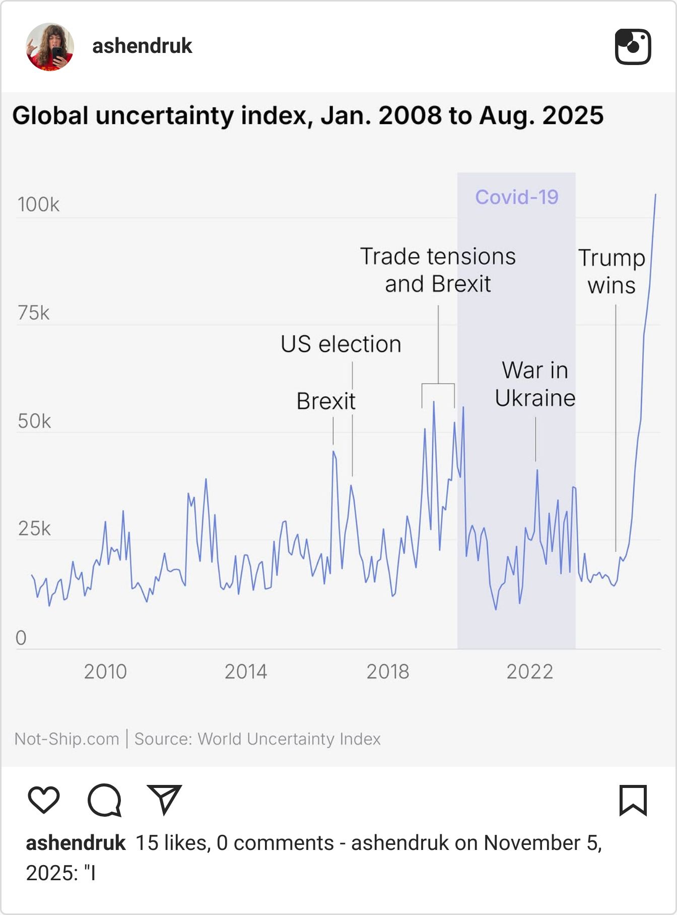
Once you understand your audience, choices about gridlines, labels, and color stop being matters of taste. Every element either helps that reader understand the data or gets in their way.
In the same vein, always ask: What does the reader get out of this?
Amanda’s biggest objection to poor data visualization: When a chart is designed to look impressive rather than communicate meaning — when a chart is all flags, angled bars, and visual flourish, with no clear takeaway. If the insight isn’t obvious, the chart isn’t finished. And, of course, label your axes.
Put the main finding in the headline.
“Most countries provide between 20 and 40 paid days off” gives you a definite statement. “Statutory paid holidays by country” only tells you what the chart is about. A reader scrolling past should be able to immediately know what story your visual is telling.

Amanda starts with the highest and lowest values, then obvious reference points, then the places your readers are likely to look for themselves. If you’re writing about a particular country, label that too. If something matters, don’t be afraid to say it twice.
You don’t need to label everything; you just need to anticipate where the eye will go.
Make depth optional.
Amanda builds charts in layers.
The headline delivers the main finding
Additional visual cues reward readers who linger.
On her paid-holidays chart above, for example, dots are colored by region, revealing that Europe tends to sit above the global average — an insight she never has to spell out in the copy. The main point should be unmissable; everything else can be discoverable.
Aggressively edit.
Amanda treats subtraction as seriously as she does additions. Small choices — like outlining the dots you want readers to notice (in the vacation-days chart above, Amanda does this to highlight the countries most relevant to her specific audiencE) — can direct attention without another sentence of explanation.
In the vacation chart, Amanda labels the Y axis by tens. Gridlines every five units may have made it more technically precise, but would’ve functioned as clutter for this specific case.
Her father, a logo designer, taught her that a logo should work in black and white before it works in color. The chart equivalent: your visualization shouldn’t fall apart for a colorblind reader.
Take the below Wikipedia-pages chart, for instance: The categories don’t need color: a television marks entertainment; a dazed face, someone who recently died. The meaning isn’t lost if you print in grayscale, and adding color simply makes the calendar sing.

The rest of Amanda’s method is here, too. The headline delivers the finding; the subhead gives it scale. Black outlines isolate patterns worth noticing, while annotations — from Squid Game to David Lynch to Val Kilmer — anchor the data in moments readers already recognize.
Vet the data before rendering the visualization.
When sourcing data, Amanda starts with academic papers, the UN, the World Bank, and government agencies, then checks the credibility of the underlying institution or journal. With companies, trade groups, and white papers, she asks what the publisher stands to gain from the finding.
If you can’t see the methodology, don’t use the data, is a hard rule for her. You can’t interrogate a number if you don’t know how it was made.
